
As we’ll see in this article, there are techniques you can use today to draw separator lines with CSS, but they also come with limitations.
In this article, we’re introducing CSS gap decorations, a new proposal which we would love your feedback on. If this is of interest to you, read this article and help us shape the future of CSS by providing your feedback.
Existing workarounds and limitations
Using the border CSS property is a very common way to draw separators. However, it also comes with limitations and, with today’s CSS layout techniques, such as CSS Grid and Flexbox, using borders can often be in the way of simpler code.
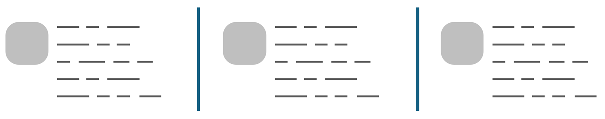
Imagine a Flexbox container, with multiple items laid out horizontally:

One way to display a vertical separator between the items is to add a border to the right, or left, of each item. Some of the drawbacks with this solution are:
- Adding a border changes the size of the items, which might not be desirable.
- This technique requires you to write special code for the first or last item, to avoid drawing an extra border before or after that item.
- Borders are tied to items, not to the layout the items are in. Imagine a flexbox layout with multiple wrapping lines. With a border, you wouldn’t be able to display a separator line that spans the entire horizontal space between the multiple wrapping flex lines.
Another way to display separators is to use the ::before or ::after pseudo-elements. Each flex item would position a pseudo-element either before or after itself, such that it sits in between the items. One advantage here is that pseudo-elements support all the styling properties that normal elements do, allowing you to be very creative with your separator lines. However, this is still a workaround which also comes with drawbacks:
- Special code is needed for the first or last item, as before.
- Some complex absolute positioning code is needed to position the separator line, which requires you to know the size of the gaps between the items.
To make things more complicated, imagine another example where a CSS grid container defines a few rows and columns, and where some grid items occupy one cell, while others span multiple cells:
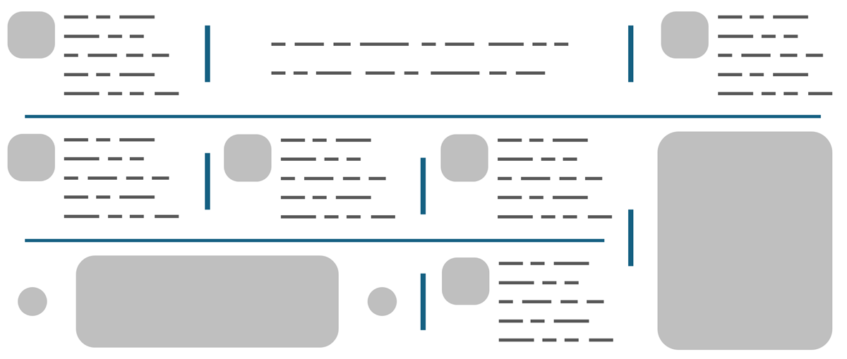
Using CSS borders or pseudo-elements to add separators between items of the grid can quickly get complicated. This is especially true if the grid is responsive and the items don’t always occupy the same position or span the same number of cells.
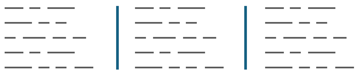
One workaround you can use in this case is to artificially draw separators by letting the grid container’s background color show through a grid gap, and making the grid items match the background color of the page.
body {
  background: white;
}

.container {
  display: grid;
  grid-template: repeat(4, 1fr) / repeat(3, 1fr);
  /* Adding a 2px gap between cells. */
  gap: 2px;
  /* Setting the color of the gap by giving the container a background color. */
  background: black;
}

.item {
  /* Hiding the background of the container by giving items a background color. */
  background: white;
}
This creates the illusion of separator lines between the grid cells. This technique addresses the issues that the previous methods faced because the gap CSS property handles the complicated logic of knowing where the space between the items is located. You no longer need to know where to place borders or pseudo-elements.
However, this is also just a workaround which falls short in some cases:
- Setting the length of the separator lines isn’t possible. The lines will always fill as much of the gap between the cells as they can.
- If the grid contains one or more empty cells, the background color of the container will be visible in those cells, breaking the illusion of the separator lines.
- If the grid items don’t stretch and fill their assigned cells (e.g.
place-self: center), then the background color of the grid container will also be visible outside of the gap areas. - Finally, this technique doesn’t work if your page background isn’t a plain color.
One more way to draw lines between sections of content in a layout is to use the column-rule CSS property, which works in multi-column layouts.
If your content can be laid out in columns and if you only need separators between those columns, then using multi-column layout is a great option.
However, this only work in multi-column layouts, which might not always be the right solution, depending on what you’re trying to achieve. For example, in a multi-column layout you can’t control where content goes in the inline direction, only in the block direction.
The CSS gap decorations proposal
We’re introducing a new solution to address the above shortcomings: CSS gap decorations.
As mentioned before, you can already use the column-rule CSS property (and corresponding column-rule-* longhand properties) to draw lines between columns in a multi-column layout. With CSS gap decorations, we’re proposing to:
- Extend the property to apply to other layout types, such as grid and flexbox.
- Introduce the
row-ruleproperty to match withcolumn-rule. - Expand the syntax of these properties to allow for different gap decorations in different parts of a container.
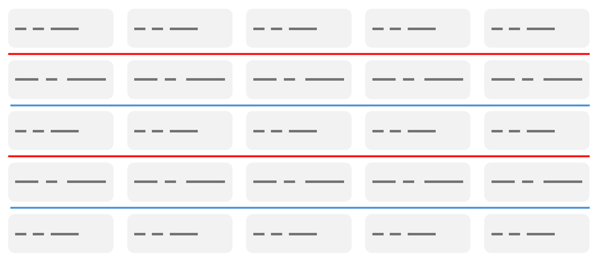
Here is an example demonstrating how the proposed row-rule property, and its new syntax, allows for multiple decorations to be defined:
alternate-red-blue {
  display: grid;
  grid-template: repeat(auto-fill, 30px) / repeat(6, 100px);
  gap: 10px;
  row-rule: 1px solid;
  row-rule-color: red blue;
}
The multiple color values in the row-rule-color property are used to alternate the color of the row gap decorations, as shown below:
A similar syntax could be used to define a thicker line on the first and last row of a grid, and a thinner one on the other rows:
.varying-widths {
  dispay: grid;
  grid-template: repeat(auto-fill, 30px) / repeat(6, 100px);
  row-gap: 10px;
  row-rule: 5px solid black / repeat(auto, 1px solid #666) / 3px solid black;
}
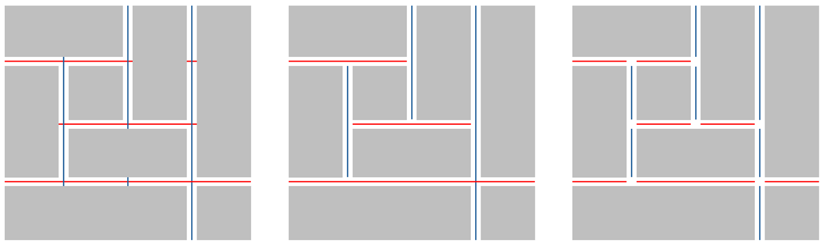
The proposal also makes it possible to fine-tune gap decorations using additional properties. The *-rule-break and *-rule-outset properties control where gap decorations start and end relative to items in the container, including spanning items.
For example, you can make your gap decorations extend as far as possible along the centerline of a given gap, or stop at intersections, and even fine-tune how much of an offset you want between the decoration and the intersection, and in a way that even works when there are spanning grid items.
Help us shape the proposal
We’re excited about the CSS gap decorations proposal and want to make sure it matches your needs. Developer feedback as early as possible is crucial for building useful APIs and features.
To learn more about our proposal, read the explainer. If you have any feedback about it, please let us know by opening an issue in our GitHub repo.
One specific area where we would love more feedback is controlling the behavior of gap decorations at intersections. But we also welcome any other feedback on the proposal: suggestions for things we might be missing, scenarios that we might be overlooking, anecdotes of when you could’ve used this, or even just a general “this sounds cool” message.